
MAKING EPUBS: WHERE GREAT TOOLS MEET REAL CREATIVE LIMITS
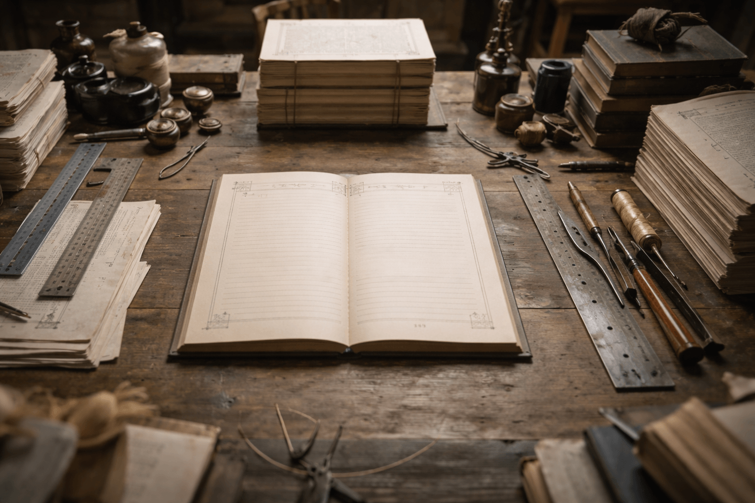
MY VELLUM IMPRESSIONS
Creating an ePub today is both easier than ever and more constrained than it should be.
On one side, you have tools like Vellum that make the process almost frictionless. On the other, you quickly hit a ceiling the moment you try to do anything beyond a “standard novel.”
This post breaks down that tension from real-world use: formatting both short stories and full-length novels, including projects that rely heavily on typography and visual storytelling.
THE STRENGTH OF VELLUM (AND WHY IT’S POPULAR)
Vellum succeeds where most publishing tools fail: it removes complexity.
You can import a manuscript, structure chapters, and export files that work reliably across:
- Apple Books
- Google Play Books
- Amazon Kindle
- Kobo
- Nook
That alone is significant. ePub compatibility is notoriously fragile, and Vellum abstracts away most of the technical mess: CSS quirks, device inconsistencies, rendering issues.
The result:
- Clean, consistent layouts
- Professionally structured navigation
- Minimal technical overhead
For standard publishing workflows, it does exactly what it should.
Where It Breaks: Beyond “Standard Books”
The limitations appear the moment you try to push the format creatively.
No Real Support for Interludes
There is no dedicated structural element for interludes.
Workaround:
- Use “Uncategorized” sections
Problem:
- You lose chapter-level behaviors (navigation consistency, formatting hierarchy)
- It feels like a hack, not a feature
This matters more than it sounds. Interludes are not edge cases: they are common narrative tools, especially in genre fiction.
Typography as a Storytelling Tool (Unsupported)
If your writing relies on typography,different fonts, visual tone shifts, stylistic emphasis, you hit a hard wall.
Vellum:
- Offers a fixed, curated font set
- Prioritizes consistency over flexibility
Reality:
- Fonts can carry narrative meaning
- Tone, voice, and even character identity can be expressed through typography
If you want something outside the allowed set, your only option is:
Convert text into images
Which leads to the next issue.
Image-Based Workarounds Are Constrained
Using images to simulate typography introduces new limitations:
- Scaling issues across devices
- Loss of accessibility (no selectable text)
- Increased file size
- Inconsistent rendering depending on reader
Even when it works, it’s fragile.
This is not a creative solution—it’s a workaround forced by tooling constraints.
ePub Limitations vs. Software Limitations
Some restrictions are inherent to the ePub format:
- Limited font embedding support (and licensing concerns)
- Device-dependent rendering engines
- Inconsistent CSS support across platforms
However, not all limitations come from the format itself.
Examples of what could be improved at the software level:
- Structured interlude elements
- More flexible style systems
- Better hybrid text/image integration
- Advanced layout overrides for specific sections
The distinction matters:
Not everything is an ePub problem, some of it is a tooling philosophy problem.
The Core Issue: Designed for the Average Book
Vellum is optimized for:
- Linear narratives
- Minimal stylistic variation
- Traditional publishing expectations
That’s not a flaw, it’s a design choice.
But it creates a gap:
- The moment you step into experimental or stylistic storytelling, the tool stops evolving with you.
A Niche Inside a Niche
ePub creation is already niche.
Creative, design-driven ePub storytelling is even more niche.
Which raises a valid expectation:
If a tool exists in a niche, it should cover the full range of that niche, not just the safest 80%.
Authors today are:
- Mixing media
- Using typography intentionally
- Structuring narratives in non-linear ways
The demand exists. The tooling hasn’t caught up.
What’s Missing (Concrete Improvements)
If ePub tools were to evolve meaningfully, the following would have the highest impact:
Structural Features
- Native “Interlude” blocks (with TOC and styling control)
- Custom section types with independent formatting rules
Typography Control
- Expanded font support (including safer embedding workflows)
- Section-based font overrides
- Style layers instead of global presets
Image Integration
- Better scaling logic across devices
- Hybrid text-image blocks
- Anchored visual elements that behave predictably
Advanced Mode (Optional)
- A controlled “power user” mode exposing:
- CSS overrides
- Layout tuning
- Device preview differences
Without forcing beginners into complexity.
Reality Check
If your project is:
- Straightforward
- Text-first
- Structurally conventional
Vellum is one of the best tools available.
If your project depends on:
- Visual storytelling
- Typography as narrative
- Non-standard structure
You will spend time fighting the tool or working around it.
Conclusion
The current state of ePub creation is defined by a trade-off:
Ease of use vs. creative control
Vellum sits firmly on the side of ease.
For many authors, that’s enough.
For others, especially those treating the book as a designed experience rather than just a container for text, it exposes a clear gap in the ecosystem.
The format may have limits but the tools are limiting it further than necessary.
In the case of our novels, and especially The Refusal, which relies heavily on varied typography and, in some cases, experimental effects, we strongly recommend the print version for the most complete experience, as it is the only format in which we can fully realize what we envisioned. Unfortunately, in the current state of affairs, we have not yet found a way to translate most of this work into the ePub format.


All our short stories are available in ePub format for our newsletter subscribers. All have been formatted using Vellum.
© Copyright 2026 WARRIORS OF THE LAST DAYS All rights reserved Privacy Policy
 Stéphane Roy is a lifelong reader and writer with a deep love for science fiction, apocalyptic worlds, and tightly constructed mysteries. This is his first novel. He lives in the Yukon with his dog and his aquarium, where long winters, silence, and wide, sometimes glowing, skies leave plenty of room for imagining the end of the world, and what might come after it. He is also waiting, with cautious optimism, for the aliens to finally reveal themselves and straighten us all out.