
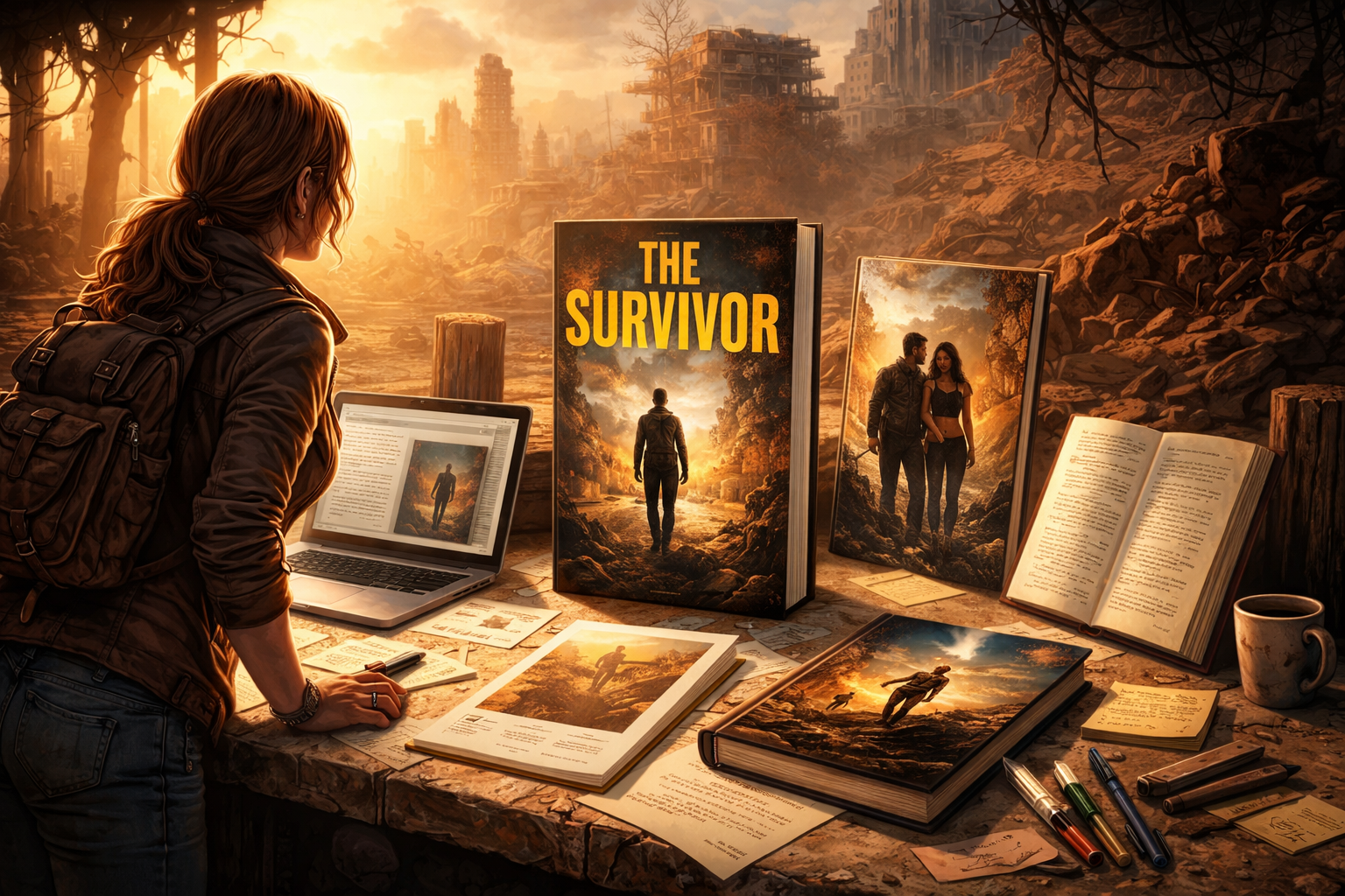
What Making My Own Book Covers Taught Me
I went into this assuming a good image and a strong idea would be enough. It isn’t. A book cover isn’t just design, it’s positioning. It has a job to do in a fraction of a second, often at thumbnail size, often in a crowded field, often for someone who has never heard of you.
These are the lessons that actually moved the needle.
1. Don’t Lead With Your Name (If No One Knows It) ON YOUR BOOK COVER
Putting your name at the top only works if your name already carries weight. If you’re unknown, you’re using the most valuable real estate on something that has zero decision value for the reader. It doesn’t help them choose. It doesn’t tell them anything about the story.
The hierarchy should reflect reality: the reader is not buying you yet or ever: they’re buying a promise. Lead with that.
Quite frankly, I would not even put my name on the cover, if it was up to me. But apparently, it needs to be there never the less for future reader. Just put it at the bottom.
2. Put the Title Where It Can’t Be Missed ON YOUR BOOK COVER
The title is the entry point. It needs to be visible instantly, whether the book is on a shelf, in a stack, or reduced to a tiny thumbnail online. If someone has to look for it, you’ve already lost them.
Top placement works because it aligns with how people scan. It also survives bad conditions: partial obstruction, low contrast, small size. The title should be the first thing the eye locks onto, not something discovered after the image.
3. Cream Paper Matters More Than You Think
This one feels minor until you see it side by side with other books. Most fiction is printed on cream paper for a reason. It’s easier on the eyes over long reading sessions, and it signals “this belongs here” when placed next to traditionally published titles.
White paper has its place, but it often reads as clinical or instructional: closer to non-fiction, manuals, or workbooks. If you’re writing fiction and you want to match reader expectations, cream paper is the safer, more professional choice.
4. Interior Formatting Is Part of the BOOK Cover’s Promise
The cover sets expectations. The interior either confirms them or breaks them.
Indent paragraphs. Remove the extra space between them. This is how most fiction is read, and readers feel it immediately when it’s wrong, even if they can’t explain why. Spacing between paragraphs signals separation: a shift in time, perspective, or scene. If everything is spaced out, nothing feels intentional.
Consistency here reinforces credibility. Sloppy formatting undermines it.
5. Your BOOK Cover Must Signal the Genre Instantly
A cover is not the place to be subtle about what the book is. Readers are not decoding your intent: they’re filtering. If they can’t tell what kind of story this is within a second, they move on.
At least one clear trope needs to be visible: a visual cue, a mood, a composition that anchors the book in a recognizable space. Post-apocalyptic, romance, thriller, sci-fi, each has a visual language. You don’t need to copy it, but you do need to speak it.
Clarity beats cleverness every time.
The Core Realization
A book cover is not about what you want to express. It’s about what a stranger needs in order to decide. Every choice, title placement, typography, paper color, formatting, imagery, either reduces friction or adds to it.
When you’re unknown, you don’t get the benefit of the doubt. The cover has to do all the work upfront.

© Copyright 2026 WARRIORS OF THE LAST DAYS All rights reserved Privacy Policy
 Stéphane Roy is a lifelong reader and writer with a deep love for science fiction, apocalyptic worlds, and tightly constructed mysteries. This is his first novel. He lives in the Yukon with his dog and his aquarium, where long winters, silence, and wide, sometimes glowing, skies leave plenty of room for imagining the end of the world, and what might come after it. He is also waiting, with cautious optimism, for the aliens to finally reveal themselves and straighten us all out.