
The Covers That Weren’t Supposed to Look Like This
Every book needs a cover. That much is simple. What nobody tells you is how many decisions are hiding inside that one sentence.
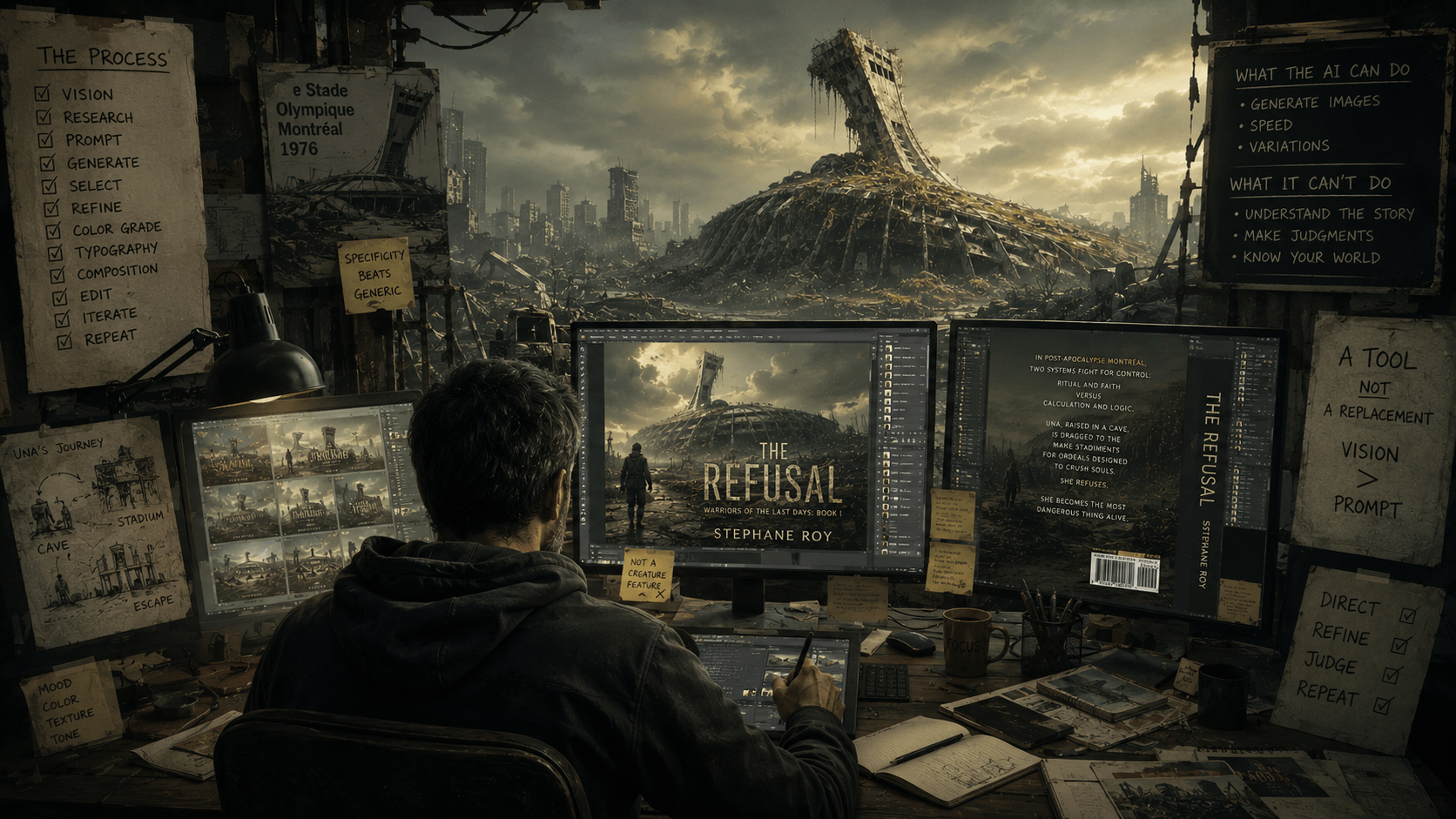
When I started working on the cover for The Refusal, the first book in the Warriors of the Last Days series, I had a clear image in my head. Una, my protagonist, facing the ruins of the Olympic Stadium in post-nuclear Montréal. Her back to the reader. A weapon in her hand. The Stadium overgrown and collapsing ahead of her. The road between them littered with the evidence of a world that didn’t end so much as reorganized itself into something worse.
I also had no budget for a professional cover artist.
I want to be direct about that because a lot of conversations about AI-generated art dance around the economic reality. A qualified cover artist for genre fiction costs between $500 and $2,000 for a single image. A cover designer on top of that. A print-ready wrap with spine and back cover. Studio time. Revisions.
I spent over ten years hiring artists for comic book covers. I know exactly what good illustration costs and what the negotiation looks like and how many rounds of revision it takes to get from your vision to something close to it. The money wasn’t there. The time wasn’t there either.
So I used AI. Specifically, I used it the way I used to use a camera on a film set, as a tool that captures something close to what you see in your head, not as a replacement for the vision itself.
The Starting Point Problem
The first images the AI gave me were exactly what you’d expect. Generic post-apocalyptic rubble. A woman with a weapon. Destroyed city. Dramatic sky. Technically competent, emotionally inert, indistinguishable from a hundred other covers in the category.
That’s what happens when you prompt AI without a specific world in your head. It reaches for the nearest available template and gives it back to you with high production values. The result looks like a cover. It doesn’t look like your cover.
The Olympic Stadium changed that.
I didn’t ask for a ruined city. I asked for the Stade Olympique, the Big O, Montréal’s most complicated brutalist landmark, the tower visible from half the island, the building that has been simultaneously beloved and cursed since it was built for the 1976 Olympics and didn’t finish paying for itself until the end of 2006. A building with a specific silhouette that every Montréaler recognizes instantly and most Canadians can place.
When the AI generated a recognizable version of that structure, overgrown, collapsed inward, covered in biological mass that exists in the novel, the cover stopped being generic. It became specific. It became this story and not any other.
That’s the first lesson. AI doesn’t give you specificity. You bring the specificity. The tool renders it.
What the Tool Cannot Do
I generated three cover concepts. One with the Stadium. Two with creatures from the novel: a bicephalous giant rat in a flooded metro tunnel, a massive predator erupting from water.
The creature covers failed. Not because the images were technically poor but because they misrepresented the book. The Refusal is not a creature-feature novel, despite the fact that creatures are very present in this world. The horror in it is institutional.The scariest character wears clean grey robes and has practiced hands and a very calm voice. Putting teeth and claws on the cover would have attracted exactly the wrong readers and disappointed them when they found something more interested in systems of control than in things that bite (I love things that bite but they are animals here, they are just trying to survive).
The AI couldn’t tell me that. It generated what I asked for. The judgment about what the cover should communicate, that’s not a prompt. That’s understanding your own work well enough to know what it promises and what it delivers.
The Stadium cover made that promise honestly. Una facing a ruined landmark that she will enter, survive, escape, and ultimately help destroy one day (not in book I). That’s the book. That’s the cover.

The Process Nobody Talks About
What followed the initial generation was not a design process in the formal sense. It was an editing process. The same instinct I developed making films and working with comic book artists for decades, the instinct for what the frame needs, what’s too much, what’s missing, what’s fighting itself.
The original image was grey. Competent, atmospheric, cold.
The first change was colour grading. I work in Affinity, (a free tool similar to Photoshop by the people who are behind Canva— there is a learning curve bit it is well thought out), and I applied a yellow-green cast to the entire image, the colour of a sky that has been wrong for decades, the colour of chemical fog and fungal growth and air that tastes like it came from somewhere it shouldn’t have. That palette exists in the novel. The cover needed to earn it.
The Stadium went from grey rubble to something that glowed with toxic warmth. The biological mass on its roof read as organic and alive rather than just debris. The ground, covered in roots and strange growth, developed depth it hadn’t had in neutral grey.
Then typography. Four iterations of the title treatment before I found the one that worked — a limestone texture, because Una was born in a limestone cave beneath Parc Pius-XII and the title of her story should echo the place she came from. That detail will mean nothing to a browser in a bookstore and everything to a reader who finishes the book and looks at the cover again.
That’s the kind of decision that doesn’t come from a prompt. It comes from having lived inside the story long enough to understand what its objects mean.
The Back Cover
The back cover copy went through five drafts across two separate writing sessions before I found the right approach.
The problem with writing a back cover for The Refusal is that the book resists summary. Its power isn’t in its plot, it’s in its architecture, its texture, the specific way it uses form to embody content. “Woman escapes post-apocalyptic theocratic stadium” is accurate, yet tells you almost nothing about what reading it feels like.
The back cover that finally worked stopped trying to explain the book and started trying to make the reader feel the world:
In post-apocalypse Montreal, two systems fight for control: ritual and faith versus calculation and logic. Una, raised in a cave, is dragged to the Olympic Stadium for ordeals designed to crush souls. She refuses. She becomes the most dangerous thing alive.
That’s not a plot summary. That’s a temperature. The reader who responds to that temperature is the reader the book is for. The reader who doesn’t is better served by something else, and the cover has done them a favour by being honest.

What the Physical Object Does
I’ve been looking at this cover as a screen image for months. Individual elements, individual decisions, individual iterations.
When I assembled the full print wrap, front cover, spine calculated for 442 pages of cream 70 paper, back cover, colophon, barcode, ISBN, something changed.
It stopped being a file. It became a book.
The spine width calculated from the actual page count and paper stock. The price encoded in the barcode. The copyright line. The publisher imprint. The physical dimensions of the object that will sit on a shelf or arrive in a box and be held by a person who doesn’t know yet whether they’ll love it.
That transformation, from image to object, is what the proof is for. The proof will tell me things the screen cannot. Whether the limestone texture on the title survives at print resolution. Whether the cream paper shifts the image palette in ways the screen preview doesn’t show. Whether the spine text is readable at actual spine width with the book in your hand.
The proof is where the cover becomes real. They will arrive next week, both the trade paperback and the hardcover versions.
The Honest Assessment
AI covers have a recognizable quality. The hyper-realistic rendering, the technically correct lighting that is somehow emotionally flat, the texture that is almost right and not quite. Readers who look carefully will see it. Some of them will care. Most of them, will not.
What matters to me is whether the cover is honest to the content, specific to this story, and legible at thumbnail size on a digital storefront. This one is all three, in my opinion. It took a full week of iterations, market research, typographic decisions, colour theory, and understanding the novel well enough to know what image it deserved.
That’s not a simple AI prompt. That’s craft applied to a constrained tool to produce something specific.
The tool didn’t make this cover. The tool made the starting point. Everything after that was the same work it has always been: knowing what you’re making, knowing who it’s for, and refusing to stop until the thing in your hand matches the thing in your head.
I understand, at least in part, the current epidermic fear of some people around AI generated content, especially images. But it remains what is is: a tool. You can use it badly or you can use it well. And depending on our levels of skills, we can modify it, improve it, or make it worse. If you just accept what it spits out, without any attempts to get closer to your vision, if you do not try to improve on it in terms of its specific generated look, the end result will not have any real impact.
But if you approach it with a designer or cinematographer eye, spend time and effort to improve the output, you can bring it closer to something that is more representative of your intent. I have paid for art a lot in my life. Most interactions where delightful. The ones that were bad left a sour taste however.
People wanting insane amounts to correct eyes that were objectively bad to anyone who looked at the picture (had to hire another artist to correct the illustration at a more reasonable price), people who do not deliver, disappear (especially after getting paid an advance), people who missed deadlines by days, weeks, months… Hiring an artist is not always a garden of roses either.
And I have to say, despite everything, that this is the first time (but it was not easy by any stretch of the imagination: stupid guardrails, seriously beyond belief), such as a child hunch over a pond of water would not be drawn without seriously ludicrous hoops jumping because the machine had guardrails against children’s harm and drowning… Or a person looking at a fissure on the ground was a situation where a human was in grave danger… Really? A giant eel in a lake, for some reason, was a hill the machine was willing to die on. Telling it it was for a novel did not help. So it was not easy.
The series needs to be uniquely Canadian. People need to be able to instantly recognize the landmarks amongst the ruins. The covers need to reflect that immediately. It would have cost a fortune to do it traditionally.
In my humble opinion, this process is still how I got the closest to what I saw in my mind. for the first time in my life. I did get close, both making movies and comics and some where really satisfying. But the average here, was phenomenal, as far as I am concerned.
It took months. Long days. I had to rework the images I was going to use for print. It was not easy. It was not simple. It was creative in a different way. It is not art I created. It is art I directed. Where, despite (really stupid) guardrails, I still managed to get closer to what I wanted, most times, than most art I ever commissioned in my life. AI is a tool. If you use it like one, it does have value. At least, it does for me. You’ll be the judges.
Warriors of the Last Days: Book I — The Refusal is available now.
The proofs are on their way.
© Copyright 2026 WARRIORS OF THE LAST DAYS All rights reserved Privacy Policy
 Stéphane Roy is a lifelong reader and writer with a deep love for science fiction, apocalyptic worlds, and tightly constructed mysteries. This is his first novel. He lives in the Yukon with his dog and his aquarium, where long winters, silence, and wide, sometimes glowing, skies leave plenty of room for imagining the end of the world, and what might come after it. He is also waiting, with cautious optimism, for the aliens to finally reveal themselves and straighten us all out.